Introduction
Drawing Sydney discusses the visual contours of a global city on the West Pacific Rim. Building on new research on city branding, the paper discusses how the "image-ability" or "idea" of the city may be gauged through visually oriented research methodologies. It is particularly concerned to offer a snapshot of the perspectives of young international visitors and sojourners, who offer fresh, and critical, perceptions of the city?s appeal and drawbacks. Focussing on paths and colour, the paper then argues that the perception of Sydney by visitors does not suggest an inherently cinematic contour. We contend that the scope of the city?s imaginary reach, especially in the perception of international visitors, appears directly suited to lifestyle and tourism.
Using a methodology derived from Lynch?s premise of mapping and plotting spatial meaningfulness, this investigation therefore sought out the paths of Sydney through maps drawn by international students, and short term residents of the city. We discovered that Sydney has very few paths that are known to the visitor, but those that are there are strong and predictable. They run across the city from the airport in the east to the northern beaches. There is only one mention of the western suburbs and no hint of the inner west, or the south, or the shires (except the odd mountainous flourish to indicate Blue Mountains). All paths converge in the CBD where there is a seemingly inescapable set of visual landmarks and where the built environment takes meaning from its proximity to what we might call "key signs of place", or "indicators of image-ability". The pattern is striking.
In a parallel strand of the same research, we tested the chromatic metonyms for global cities. Many cities had strong chromatic character but were not without some consistent variations and contradictions. Sydney was simply, utterly, blue. Some respondents questioned whether the palette that we provided gave them the right set of blues to choose from, but the vast majority chose from that spectrum nonetheless. This set of results has given us pause for thought. Blue holds connotations of cold clarity, of fear, of endless horizons. How does blue work with the path through Sydney?s suburbs, how could it warm an audience to the perfect autumns, or the dense wet heat of summer? How could it distinguish the energy and loneliness of cultural difference, or the settled parochialism of suburban loyalties? How might the chromatic character contribute to the complex narrative of arrival, striving, and stasis which characterises Sydney?s urban character? The blueness of the city has been recently explored in cinema and television (Finding Nemo [Andrew Stanton & Lee Unkrich, 2003], Looking for Alibrandi [Kate Woods, 2000] and Hell has Harbour Views [Andrew Duncan, 2005]), and, as a reviewer of this paper pointed out, escaped through dramas such as Lantana (Ray Lawrence, 2001). Nonetheless, the relationship between the perception of city residents and visitors, and professional knowledge in a particular industry is not always one of perfect consonance. We wonder, for instance, whether if tourists visit Sydney for its lifestyle, clarity of colour and iconic simplicity some are perversely disappointed by that when they get here?
It may well be that such stories and the chromatics of those stories are waiting to be told anew. But we remember the glimpse of the blue harbour in Nicolas Roeg?s Walkabout (UK, 1971), the film that represented Australia to a generation of potential British migrants, and a film where in the closing sequence ? in the clutches of the depressing memory of David Gulpilil?s on-screen death and Jenny Agutter?s adult slump into aspirational domesticity ? the blueness of Sydney is shockingly intense, but not on its own behalf. It recalls the blue of the walkabout skies, and suggests that this harsh Sydney blue makes the city an urban metonym for the imagined hinterlands, and at the same time comments on its inability to match the emotional scope of the bush.
FlatlandsEdward Tufte, a professor in information and statistical design, exhorts us to "escape flatland"; to get out of the first dimension and find strategies "for extending the dimensional and informational reach of display flatlands" (1990:15). Tufte?s main concern is to allow statistics to speak clearly and effectively to those who must understand them. In practice, this requires a visualisation of well-chosen statistical, evidential or topographical enquiry. His prime case study is that of the cholera epidemic in London in 1854, when Dr John Snow in a "classic of medical detective work" (1997:5) used a map to work out where the disease was prevalent and therefore to determine its epicentre and possible cause. He isolated a water pump in Broad Street, W1. Tufte?s use of this case is to illustrate that first, Snow had a good idea and so collected the right kind of evidence, and second that Snow was unfailingly logical in pursuing the outcome of his data to a conclusion. Snow?s map showed streets, but it also marked deaths from cholera and water pumps. The Broad Street Pump was the closest to the death clusters, and ? where there were exceptions ? he found the reason. The brewery and the Workhouse had relatively low deaths ? the Brewery because workers drank "small" beers instead of water and the Workhouse because it had a singular water source. The map visualisation, and not the time series graph of the data, told the story.
Meanwhile, thirty years earlier than Tufte, Kevin Lynch had introduced the idea of place legibility into thinking about urban design and cityscapes (Lynch, 1960). Indeed Lynch validated the very idea of "thinking about a city" through visual schema, in so far as he allowed its useability to be entertained as a category of thought by those who designed and planned urban space for everyday life. His experimental work on urban navigation by icon, landmark, and features of the streetscape combined to an index of imageability, which took the experience and visual memories of residents and visitors into close account. Lynch drew the responses of his subjects into cognitive maps, which were coded to describe not a flatland but a thick description of what it felt like to move around in a particular space. From Lynch we learn that it is the traversability of the city, the paths, which underscore its success or failure.
We suggest in this paper that urban paths are indicative of narrative contours, and that they must be matched with the chromatic tones of a particular city?s visual field. Dr Snow came to understand the city through exhuming an "imageability" from the numbers of the dead and from the very particular landmarks which referred to the cause of death. Lynch understood that the city could never be known in any lasting way without such landmarks, points of reference and distinctions.
In the images that we have collected over the past year, by asking respondents to draw cognitive maps of Sydney, we see the city?s paths enunciated through simple accounts of iconographic landmarks and their relative positioning. We learn from these responses that Sydney?s landmarks are well known by the new arrivals, but that there is very little evidence of an imagined hinterland to the city in the way that they draw it. It is unconnected to a larger world, or to an inner world of desired paths and dreams. It is a city of desirable destinations without journeys, and of functional arrivals without any imaginative possibilities beyond the limits of safe space. There is often emptiness between locations, and restricted human activity. In a narrow sense the city is successful: it can be clearly articulated on paper. Yet, as the maps remove us from the flatlands of representation of space, they deliver us back into a flatland of experience.
The maps fall into three categories of description. Sydney is a university city, a beach city, and a tourist city. The first is organised by campus and affords little sense of the city as a human or natural environment. The logic of the relationship between the campuses orders the path, and that in turn curtails the possibility of an urban character emerging through the visualisation. The second is a little more promising. There are people in this map, and they are all on the beach, or perhaps they are at Circular Quay? The path of this city is minimal, however. The people stay at the water?s edge, and something that might be George Street meanders from nowhere to the Opera House. Trapped as they are, they may or may not be tourists. The third map has much more informational detail than the other two, but is more sterile that the second, and less demographically specific than the first. Here, there is an itinerary to fill three days of central Sydney tourism, including a trip to the markets in Balmain and Glebe, and to the Zoo. There is, however, a paucity of character or context, or of any sense of Sydney extending beyond the path detailed by tourism activity. In these visualisations, and they were typical of this group, Sydney is predictable, water hugging, and tightly drawn around the CBD. It has one path, which starts at the airport or in a dead end (or a dead beginning).
The respondents to the cognitive mapping exercise were mainly young and international, and many were students. So, this drawn city reflects their demographic predilections. However, the data is also supported by a much larger sample of three hundred responses to questionnaires about the "character of the city". Summarised, these comments separate out "Sydney" from "the West", and even in the centre of the city only certain aspects are classified as of Sydney. These aspects again cluster the city around the path identified in the maps:
A harbour city with vibrant nightlife. Geographically beautiful, architecturally confused. Vivid light and starkness of colour mostly a blue city with water and sky dominating. Parts of the inner city resemble cities everywhere ? the downtown of Central and environs are grey, dirty and noisy.
But:
"The West is a huge, expansive, amorphous tangle of human wasteland."2
Figure 1. Drawing Sydney ? new arrival, 2004 (ESL Student from Italy)
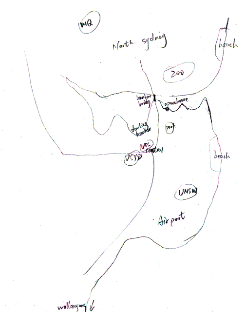
Figure One is the University City. There is a path from the Airport through UNSW, UTS, University of Sydney and Macquarie. There are recreational paths, beaches in the east and south, and four landmarks clustered in the CBD. The Zoo is mentioned, but beyond the path weaving from campus to campus, and Central station in the middle, the orientation east to north follows the logic of student aspirations and needs.
Figure 2. Drawing Sydney -one year visitor-resident: Liminal spaces.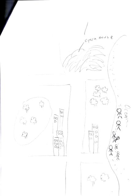
Figure Two is the Beach City. Here the city is more familiar. There is less naming of landmarks and more of an expectation of recommendation. The Opera House and the ocean are still named, as the Sydney "fixers". There is activity in this image. There are people, all on the beach. Although the map is not accurate in its orientation, it effectively suggests that the path through the city leads between nothing in particular and the major tourism icon, and that actual human interest is by the shore.
Figure 3 Drawing Sydney ? six months student visitor: orientation to the CBD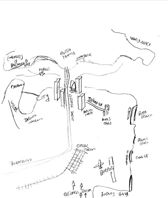
Figure Three is The Tourist City. This is a developed image of Sydney, again focussed on the main tourism centre, but with some sense of central suburbs (Glebe, King?s Cross, and Balmain). Naming is used to manage the spatial accuracy of the "map" (the three big tourist beaches are in order) and transport is highlighted: the Bridge, the Airport and Central rail station indicate possibilities of arrival (and departure). Again the city path is singular, the George Street/ Parramatta Road indicates the main route, and its environs cluster round it as the defining stretch of the city?s spatial identity.
Figure 4: Drawing Sydney ? the Unimaginable West!
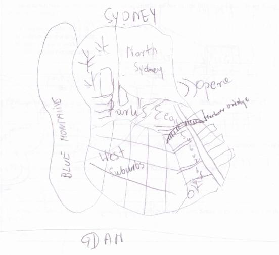
Here Sydney is a cluster of conceptual areas: the parks, the mountains, the north, the east and the west, again, fixed? by the Harbour Bridge and the Opera House. There is no path in any area apart from the familiar route from (nowhere) (airport) to the Bridge. Each named area is divided from the others. The creator of this drawing told us that she had visited the West and it was very "despairing". We read her response as in part conditioned by a European view of the outer suburbs, usually depressed, marginalised and under-represented in the elite imaginations of European urban culture. Is she right that Sydney is moving in the same direction? Or does she fall into the trap of thinking that liminality and marginality are necessarily the same thing?
Figure 5: Gdansk (Home)
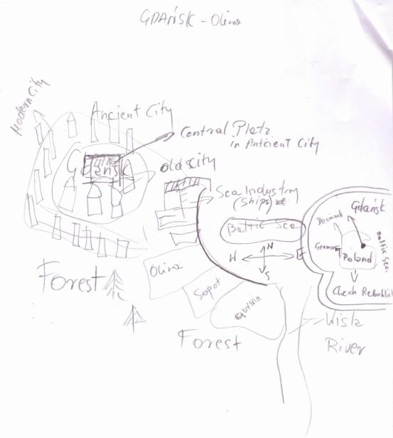
Gdansk: Historical memory, industry, the river, national boundaries and configuration. This contrasting map by the same respondent as Figure Four, shows one main difference, the European understanding of Sydney is limited because Australia is not seen to share borders with other nation states (=history), and because Sydney does not advertise its rivers as central to its identity politics. Yet Sydney?s rivers are the focus of many cultural groups, and of course, whilst Australia?s borders are sea-bound? they are not unimportant.
ColoursLynch?s subsequent work on city image and its legacy is rich, and his ideas have latterly been developed towards evaluative imaging (e.g. Nadar, 1998) and extended in recognition of the increased role of media imaging of cities (Vale and Warner, 2001). The literal categories of form: edge, line, position, scale and juncture may be considered analogous to drawing in black and white ? they are complemented by the colours, tones, and modal qualities that compose a fuller picture of the city and its affective and sensory qualities.
Colours have long been associated with cultural symbolism and also with emotional states. These associations are culturally, as well as individually, established, and are often related within more complex belief systems, such as indigenous medicine or feng shui. Whilst some associations are culturally relative, and arbitrary in the sense that the association results from an imposed mandate, (for example the convention that white is used for weddings in the West but funerals in the East) there is another tradition of identifying the colours that belong to places, through their natural, emergent or characteristic properties.
Swirnoff?s work (2000) on the colour of cities is one example. She photographed various cities and analysed their light quality to produce a typology of brightness that distinguished cities as light (e.g. Santa Fe), median or shadow (e.g. Stockholm). Other work looks at the traditional colours used in the built environment, often stemming from the pigments available locally, or relatively cheaply. Bente Lange for example has analysed the colours of Rome (1995), and of Copenhagen (1997), showing historical patterns of colours and how cities may be characterised in the public mind by the dominance of certain colours.
Karman has looked at the traditional colouring of Hungarian houses, mindful that this heritage is disappearing and suggesting that the rich vernacular art it represents is a national value. Cugley (2000) has described how local "pattern and colour (tell) a visual story, celebrating a local vernacular particular to site", and suggesting that cognisance of this palette can feed back into built environment and interior design that reinforce sense of home and belonging. Metcalfe (2001) has described how colour can gender space, and relates it to Bourdieu?s concept of habitus ? in which an expected way of being in a place is suggested by physical and design qualities. Probably the most thoroughgoing study of this type however is by Lenclos and Lenclos (2004), who have developed a method of analysing the geography of colour, and use it to demonstrate the "chromatic personalities" of regions and cities across the world. Combinations of light, geology, climate, local traditions and vernacular techniques give expressive distinction, to "contribute to the affirmation of a national, regional or local identity" (15).
Colour is currently a topical theme in architecture and urban design, with conscious decisions being made about its communicative and expressive potential in city projects with examples where colour policy has been considered at early urban planning stages (Schindler, 2004). Fontana and Matias (2004) claim that "color in the urban space fulfils an essential function for the identification of place", motivating a localised study searching for chromatic identity. Similarly Rabuini (2004) describes how an old part of Buenos Aires recovered and strengthened its traditional identity through reference to the palette of an important local artist, and the enshrinement of this palette in law. In China, as modernist development continues apace, there is agreement that colour science in city planning is lacking, and the aesthetics and grace of traditional Chinese cities is being lost in colour pollution (China Internet Information Centre, 2004). This is a mistake Japan avoided during its rapid development by planning regulation: similar regulations are already in place in many cities and regions, with moves to preserve heritage colours and styles in others.
Colour is also a central feature of formal or representative identity: a commitment made in corporate or civic marks or heraldic identity, and represented in logos, livery and publicity. As signs, these may function more or less strongly as representative of their referents, be more or less mutable, and more or less understood or accepted. A brand implies a set of values, a consumer proposition, and a public standing. Encapsulated by design choices including colours, logo, and iconic symbols, it offers quick access to public recognition and acceptance. The associations made and reinforced operate as much at an emotional level as a rational one: particular feelings such as trust, vibrancy, contemporariness, excitement or calm, may be conveyed by design. In Japan, extensive research (Kobayashi, 1990) has identified the associations between colour combinations and key image words typically used in branding, such as romantic or authoritative, work that has informed product design and manufacturing choices. These choices are made to be consistent with brand values and for projecting the (city?s) proposition, and by inference, the underlying identity and its social-symbolic value.
Efforts to patent colours (whether informally or through the courts) reflect the perceived importance of colour associations with brand in the consumer mind ? Coca Cola?s red, Kodak?s yellow, and Cadbury?s purple3 are particular examples. These often refer to particular hues, which can be formally described and located in a colour system, for example the Natural Colour System (Hĺrd, 1969), which avoids the range of interpretations and nuances an ambiguous linguistic term such as "red" implies, allowing a particular specification for trading purposes.
Such symbolic meanings "increasingly form a basis for brands" positioning and differentiation" (Siguaw, Mattila and Austin, 1999). As a brand serves as a persona for (a city) it engages affective perceptions such as trust, friendliness, pace, attractiveness and integrity: attributes traditionally associated with human personalities but perceived nonetheless, and influencing decision-making and behaviour. Identifying the emotional relationship people have to the idea of the city, as well as to their understanding of its structural possibilities begins to indicate the type of stories or narratives that are sympathetically accommodated by that conception.
Chromatics ContoursMost decisions are based on emotion at least as much as on reason (Damasio, 1994), and most narratives require emotional and rational logics to work. In identifying the feelings that people have about a product of interest, rather than their ability only to rationally describe its properties, image-based and other metaphorical methods are beginning to emerge in marketing research (Contardo, 2004). In imagining the city, an understanding of the colour associations and their rationale complements the formal drawings to provide access to the emotional and sensory experiences that seem applicable to understanding a city, and its particular qualities as perceived by those located there, whether residents, visitors, or other stakeholders.
When eliciting affective responses, or associations that may be non-conscious or implicit, an indirect approach is preferable. Projective methods, where questions of interest are asked in ways that elicit values and thoughts that may not be available when asked directly have long been used practically in forming design briefs for corporate identity. Projective methods use a metaphoric access, for example, asking "if this company was a chair, what would it be like", and from discussion around chosen examples eliciting values, such as comfortable or old fashioned, which may not have been socially acceptable to have stated directly, or which might not have even emerged otherwise. Such methods have the twin strengths of avoiding preconceived wordings or other biases by the questioner leading the response, whilst also avoiding the requirement for a high degree of articulation by the respondent, in areas in which their understanding may be more tacit. They also use the fact that, whilst people may find it hard ab initio to articulate a preference or its rationale, they can recognise it when they see it.
As part of the wider study, we examined the perception of Sydney and the attributes underlying this perception across a wide section of society, using an online survey. Among the questions asked was "If Sydney was a colour, what would it be?" and giving a reference palette that avoided the ambiguity of colour wording (Gerritsen, 1975). This palette, used widely in art theory, has 20 colour swatches covering a spectrum of hues, including white, grey and black.4 Follow up questions then sought to identify reasons for the choice and probed on the city?s visual qualities generally. Providing a contrast, similar questions on other cities were asked, in particular Hong Kong and Shanghai, both of which have strong film traditions and media representations, although these are not considered in detail here.
The survey was pre-tested on groups of tourists and residents in Sydney, in Hong Kong and in various Australian cities to establish that the questionnaire was meaningful and to allow probing of the reasons for the choices made. The numbers in these pre-tests were insufficient to be statistically significant, but qualitatively these indicated that certain colours were more frequently associated with a city, and that there were clear reasons for this attribution, discussed later. The online survey, conducted between November 2004 and January 2005, attracted responses from across the world, and has been broken down into different demographics for analysis. The Sydney based respondents only are reported here.
127 usable responses were analysed, and the response for Sydney and for Hong Kong is shown in figure 5. The number of respondents choosing each of the Gerritsen colours is shown as a bar, in a colour approximating the Gerritsen original.
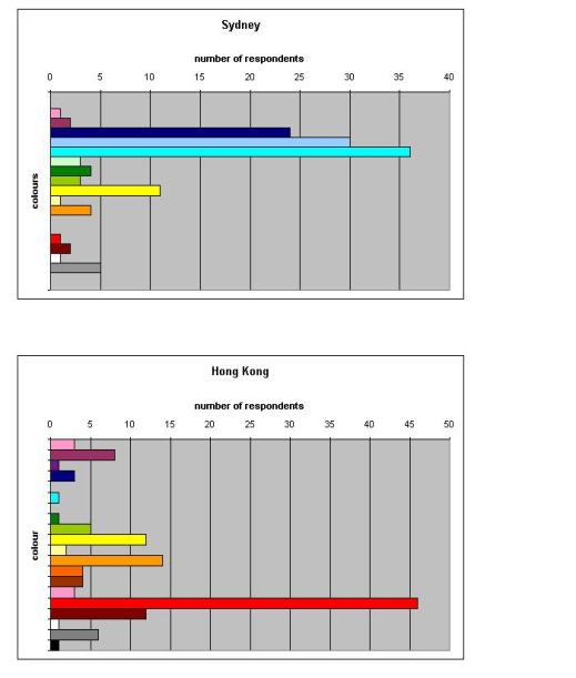
Figure 6 Chromatic profiles for Sydney and Hong Kong
It is evident that Sydney is considered "blue" with the top three choices corresponding to the three blues, with yellow a distant second, and red almost negligible. Conversely, Hong Kong is clearly seen as "red", with orange also relatively prominent and blue almost negligible.
Although there is some loss in detail, the colours can be grouped into broader theoretical categories for analysis, including categories that make broader comparisons at linguistic levels possible. Thus for example, the familiar rainbow spectrum or, the 11 basic colour terms of Berlin and Kay (1969) can be mapped onto Gerritsen?s set such that all the "blue" responses are treated together. This shows that 90 of the 127 responses for Sydney?s characteristic colour were blue, an overwhelming majority. Hong Kong is more mixed, but over half of the responses are in the relatively narrow orange to red part of the spectrum. Once collapsed into these broader categories, these figures can be statistically analysed using chi square analysis (Lowry, 2005). The pattern observed for Sydney, and also that for Hong Kong shows a frequency distribution highly unlikely to be due to chance. For both cities the difference is highly significant on chi square analyses, (p<0.001), suggesting that Sydney is meaningfully associated with the colour "blue", and Hong Kong likewise with red. Similar results, though not detailed here, have been found in the pre-tests, and in a Chinese version of the survey.
In determining the reasons for these meanings the open questions in the survey, and also those on the relevant pre-tests were analysed for content. Positive assessments appeared in the accompanying descriptions of the visual qualities of Sydney, including clear, clean, vibrant and beautiful, with the harbour, the sky, and natural environment generally occurring frequently in responses. Many respondents also commented upon the quality of light, and some noted that, despite the busyness of a city, there was a relaxed, unpressured quality about being in Sydney. We would therefore suggest that blue supports a quality of light and spirit that is not often described in the narrative films of mainstream Anglo-American story-telling, but which might be modelled through other worldviews, particularly those of Indigenous storytellers who place the city in the context of a wider and more complex vision of land and occupation, and space/time understandings of the meaning of human experience (Muecke, 2004).
Conclusions
Our study sought to determine the chromatic character of the city, and the qualities associated with that. In Sydney?s case these consistently showed the salience of the natural environment, with blue skies and the blue water of the harbour prominent among responses. Other than the iconic Harbour Bridge and Opera House, urban architecture and city layout did not figure largely in comments, which focussed more on the quality of everyday lifestyle. Significantly, the city?s chromatic character did not suggest a close relationship between the city and a consistent human narrative. This may not be at all a bad thing, but it does pose a creative challenge to Australian storytellers.
A limitation of the study entails the naming of colours, which is a contentious subject in philosophy and language research. Ten respondents nominating "blue" may have ten different shades of blue in mind. This was alleviated in the main survey by requiring choice within an identified palette, but even then, this is only a sample of the possible colour space. Another limitation relates to the presentation of colours online, as there may be inconsistencies in monitor display settings, ambient light and so on that cannot be controlled outside of a laboratory. These limitations however were not considered to be significant for present purposes ? establishing that Sydney is blue rather than red may be a sufficient basis for a general understanding.
The cognitive maps, produced by young European and Asian visitors, fall somewhere between a wayfaring diagram and a picture of what Sydney means to them after a short period of residency. The maps cannot pretend to offer more than a snapshot of visitor?s experience. We present them to argue that Sydney does inspire a strangely lean version of itself, with a noticeable emphasis on the main iconic features, and hardly any sense of movement through the city beyond one main street - which is drawn as a feature of orientation in respect to the landmarks, rather than to indicate human traffic. If we return to our opening premise, the flatlands of these conceptual pictures do seem very flat indeed. Where are the flashes of narrative energy? Where are the mysteries, the private places, and the "best bits" of a city for young and presumably adventurous visitors? Why are they strangely submissive to just one path, which leads them from nowhere (other than the airport) to a bridge and a featureless north?
This is not a paper which can offer firm answers to these questions, but which will conclude with a contentious thought on why and where the city is so constrained by its profile.
Sydney does not have an identity which inspires adventure, whether before or after arrival. Arriving in New York, the imagination is already prying into stories, the resonance of which gives narrative substance to buildings and streets that might otherwise be impenetrable. This may be in part because of a long-term financial commitment on behalf of the city of New York to sponsoring filmmakers and locations. It may be also because New York has a contour that draws on known actual and imagined paths, that use landmarks and character to insist on the intensity and specific bravura of a place full of stories. If Sydney has such stories, they are not yet told internationally. Nor does Sydney boast the literary depths of London or Paris. Enquiring in a Woollahra bookshop for the "defining" Sydney novel, we drew a blank. Someone suggested Playing Beattie Bow ? a children?s novel by Ruth Park, and a friend found memoirs of a Jewish childhood. But these were exquisite fragments, not a shared story, and not sufficiently known to amount to the layering of place and image that might let us escape the flatlands.
Berlin, B. and Kay, P. (1969) Basic Color Terms: Their Universality and Evolution, University of California Press: Berkeley
China Internet Information Centre (2004) New Urban Garbage: Color Pollution, http://www.10thnpc.org.cn/english/2004/May/96405.htm
Contardo, I. (2004) "Old And New Marketing Techniques: Using Images To Penetrate The Mind Of The Global Consumer", in Proc CMS Conference, July 2004, Waikato, NZ, www.mngt.waikato.ac.nz/research/ejrot/cmsconference/2003/proceedings/criticalmarketing/Contardo.pdf
Cugley, J. (2001) "Seeing and Sensing Place", in Proc 9th International Colour Association Conference http://www.iscc.org/aic2001/abstracts/poster/Cugley.doc
Damasio A.R. (1994) Descartes' Error: Emotion, Reason, and the Human Brain, Putnam: New York
Fontana, A.M. and Matías, N. (2004) "Color And Patrimony In La Plata City, Argentina", in AIC interim meeting Porto Alegre Brazil, November http://www.fadu.uba.ar/sicyt/color/aic2004oral.htm
Gerritsen, F. (1975) Theory and Practice of Color, Studio Vista
Goldsmith, B. and O?Regan T. (2003) Cinema Cities/Media Cities, Australian Film Commission: Sydney
Hĺrd, A. (1969) The NCS Colour Order and Scaling System, Farginstitutet: Stockholm
Karman, Z. (2001) "The Outside Colours of the Traditional Hungarian Country Houses", in Proc 9th International Colour Association Conference http://www.iscc.org/aic2001/abstracts/poster/Karman.doc
Kobayashi, S. (1990) Color Image Scale, Nippon Color and Design Research Institute
Lange, B. (1995) The Colours of Rome, Royal Danish Academy of Fine Arts, School of Architecture Publishers
Lange, B. (1997) The Colours of Copenhagen, Royal Danish Academy of Fine Arts, School of Architecture Publishers
Lenclos, J.P. and Lenclos, D. (2004) Colors of the World: A Geography of Color, WW Norton: New York
Lowry, R. (2005) "Concepts and Applications of Inferential Statistics", chapter 8 online textbook, Vassar, http://faculty.vassar.edu/lowry/webtext.html
Lynch, K. (1960) The Image of the City, Cambridge: M.I.T. Press.
Metcalfe, P. (2001) "Gender, Colour and the Domestic Sphere" in Proc 9th International Colour Association Conference http://www.iscc.org/aic2001/abstracts/oral/Metcalfe.doc
Muecke, S. (2004) Ancient Modern: Time, Culture and Indigenous Philosophy, UNSW Press: Sydney
Nasar, J.L. (1998) The Evaluative Image of the City, Sage: Thousand Oaks CA.
Rabuini, E. (2004) "Color As A Key Factor In The Cultural Inheritance Of La Boca District, Buenos Aires" in AIC interim meeting Porto Alegre Brazil, November http://www.fadu.uba.ar/sicyt/color/aic2004oral.htm#kaya
Schindler, V.M. (2004) "Colour as vocation: Werner Spillmann's contribution to environmental colour design" in Color Research & Application, 30, (1) 53 - 65
Siguaw, J. Mattila, A. and Austin, J. (1999) "The brand personality scale: an application to restaurants", in Hotel and Restaurant Administration Quarterly, 40(3), 48-55
Swirnoff, L. (2000) The Color of Cities, McGraw Hill: New York
Vale L.J. and Warner S.B. (eds) (2001) Imaging the City: Continuing Struggles and New Directions, Rutgers University Press
Notes
1 This paper is an outcome of research from an ARC funded project "Branding the City on the West Pacific Rim: Cinematic and Tourism Strategies in Sydney, Hong Kong and Shanghai"
2 The West is not a human wasteland (by the way, and despite the real problems of some ? now famous ? suburbs such as Macquarie Fields). It is a more or less comfortable set of suburbs, with small strip shopping centres, some "town" centres, new developments and quarter acres blocks. In contrast to most British metro-sprawl, the "West" would look reasonably extensive, not too clogged with traffic and enjoying good weather for much of the year. On some routes through the "West" it is possible to glimpse views of water and to slip down easily towards the sea via the Hume Highway. What the West is not, of course, is a party to a magnificent harbour and an Opera House. So, is it Sydney? The fourth map includes "the west" and the speaker also drew a complementary map of her hometown Gdansk (Poland). Spot the difference!
3 A story on this is archived at http://www.careerone.com.au/newsviews/story/0,8523,9483841-22577,00.html
4 Hue is what is commonly understood as colour i.e. the quality of redness, blueness etc. Although some formal colour systems distinguish achromatic values (e.g. white, black) from hue, using greyness as a dimension nuancing the hue, identifying distinctive basic colours was seen as the relevant characteristic here and thus white grey and black were included as elementary colours like any other.