This article offers an account of some of the storytelling and staging problems which were to arise in assembling two museum exhibitions, and tells how in both cases the graphic novel – or comic strip – proved an effective means of maximising story, information and available meaning pathways to audiences, while at the same time imparting to both exhibitions a more open, less instructivist, less obviously curatorial ambience.
In early 2001 I was invited by the Justice & Police Museum in Sydney to guest-curate an exhibition for them. At that point I had published three crime novels, all set in Sydney of the 1940s and 50s, and although they had caused only the most minor of ripples in the literary world, the writing had involved a considerable degree of research into somewhat obscure cultural histories, and this apparently had appealed to the museum people. Intriguing as the offer was, I found the prospect daunting: I had no idea of how much (or little) was expected of a curator, knew nothing of the processes by which material would be selected, how it would be arranged, how much or little collaboration was involved and so on. The museum people were sanguine about all this however, and with some misgivings, I agreed to tag along.
As it turned out, a title for the proposed exhibition had already been chosen: "Crimes of Passion". All that was needed was the content. The exhibition was scheduled to open a year's hence. Some footwork had already been done. At our first meeting I was handled a bundle of research notes and shown muzzle-loading pistol from the museum collection, which, I was told, had belonged to Louis Bertrand, one of the principals of the Bertrand Kinder case. Which meant nothing whatsoever to me. I took the research notes home.
The notes made surprisingly good reading. Louis Bertrand, it turned out had been one of the best known criminal names in mid-nineteenth century Australia. A society dentist, mesmerist and amateur thespian, he had fallen passionately in love with one of his patients, Ellen Kinder. She was married to a befuddled, alcoholic banker named Henry Kinder. Some months into the affair Bertrand, who imagined himself a towering figure of romantic love, resolved to do away with Henry Kinder. After numerous failed attempts, he finally managed to shoot Kinder while they were momentarily alone together at a dinner party. Kinder took a few days to die, however, and had to be helped along with poison, administered a couple of days later by the soon-to-be widow Ellen.
As soon as Kinder died Bertrand installed the newly widowed Ellen in his own household, in his own bed, alongside his own wife, who was kept docile with laudanum.
It got better. In preparation for the murder Bertrand had bought a cheap pistol, of a kind sold by the thousand to miners heading out to the New South Wales goldfields -- the nineteenth century's equivalent of a "Saturday night special". Bertrand had a young assistant buy the piece at a George Street gun shop, while he hovered in the background, dressed, for reasons unknown, in women's clothes (Bertrand also sported a moustache and mutton chop side levers). He spent the next few days in his basement workshop practicing for the assassination by blazing away at a sheep's skull.
Now that I knew the story, the pistol I had been shown at our first meeting suddenly mattered. That was for me lesson number one in museology: even nondescript objects can acquire an almost magical significance when they're part of a narrative in which you have already become enmeshed: the story invests the object with a charge.
I started looking around for other stories. There were plenty. Too many in fact. Over time I narrowed them down to five major cases. Next problem: how to tell them.
Books are what I'm used to, and, without really thinking about it, I'd more or less assumed that the museum display would be like pages of a book stuck on a wall. But museums work on entirely different principles, and I had not a clue what they were.
I took to hanging around Sydney's public art galleries and museums, watching visitors, observing what they looked at and what they sailed straight past. The news wasn't good. Glassy-eyed visitors in the main drifted distractedly through museum spaces, barely taking anything in, eager to move on to the café or the bar. I related: I recognised that feeling of mild dread when confronted with walls crowded with text. It was one thing to read a book or magazine at one's leisure, while sitting comfortably at home, but reading text on a wall in a public place was an entirely different matter. And part of that resistance was the sense one has of being lectured at, instructed by the text panel – indeed museum exhibitions all too frequently end up resembling nothing so much as a junior high school text book.
There was another problem. The stories I wanted to tell were dauntingly complex, even in their simplest telling. In real world criminal cases, masses of facts are assembled and recorded, then tested in the court for truthfulness. Fine points of human character and motivation are aired too, and counter speculations posited. That's one of the reasons crime is so narratively rich — all those minor human fears, desires, emotions are amplified way beyond everyday scale, to breaking point. But they remain, in kind, the same everyday desires and fears we all have.
Real crime stories are also confoundingly contradictory. Perpetrators often act irrationally, act against their own interests even. Witnesses will tell the truth about the big matters, then inexplicably lie about petty details, or vice versa. Or they misremember. Police hold parts of the story back. Defence lawyers strategise, introduce red herrings, seek to make simple truths appear contradictory. A great many fascinating but fundamentally irrelevant facts are thrown up. Then there are layers of commentary, mythologising, opinion-giving (informed or otherwise), rumour, speculation and urban myth – in short the folk lore – that a famous crime produces.
So the basic problem was forming up along these lines: we had objects to display, but these objects could only be fully potentiated when placed in their narrative context. That narrative context however was complex, and operated at multiple levels: there was the strictly factual chronology of the case and then there was a mass of diversions, digressions, interesting but non-essential small facts and asides which carried so much of the cultural flavour. And supplementary to this last was the commentary I wished to make about it all: such items as, say, the part that Louis Bertrand's Jewishness played in the depictions of him as a sinister enchanter and Svengali figure – and how consistent that was with popular representations of Jews and Jewish masculinity at that time.
The strictly factual core of the story lent itself to traditional, linear, 'three act' telling – a set up, various complications, with rising action leading on to a climax and resolution – the structure most suited to a ninety minute plus feature film, a novel, a play or series of screen documentaries.
We had material suitable for presentation in a thick book, or a long feature movie, or documentary – formats designed for people seated comfortably, with time to spare. Somehow, we had to convey all that story and interpretation to visitors who were on their feet, and already moving through the three-dimensional space of the museum.
At Sydney's Powerhouse Museum a curator friend showed me through an exhibition called Cyberworlds, about computing and early computer history. Curators had covered some of the early history of the personal computer by using simple line drawings done by British artist/television presenter Tim Hunkin (of the popular 'Secret life of Machines' television series). Hunkin's sketches were informal, but clever. They were welcoming and engaging without being in any way patronising to the visitor. Indeed, they seemed work quite the other way: they credited the viewer with wit and common sense. And those few squiggly lines had eliminated the need for literally hundred words of written exposition.
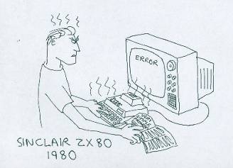
Figure 1: Cyberworlds (Tim Hunkin). Courtesy of Powerhouse Museum, Sydney.
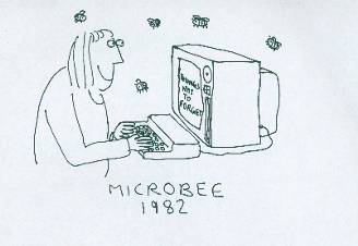
Figure 2: Cyberworlds (Tim Hunkin). Courtesy of Powerhouse Museum, Sydney.
It occurred to me that a comic strip might make a good narrative vehicle for Crimes of Passion. At that time I was reading and rereading the magisterial graphic novel From Hell, by Alan Moore and Eddie Campbell (2000). Campbell's informal but archival-looking drawings effortlessly took the reader inside the world of the Victorian slum and greatly enhanced Moore's feel for how class intersected life in that milieu. The omnibus version of From Hell also offered an extraordinary supplement: written and drawn endnotes, pages and pages of them, in which the authors further reflected, from a distance, on the story they had first told in serial form a couple of years before. The endnotes were beautifully written, and seemed to both undermine and enlarge their original story. Those endnotes contain some of the most eloquent reflections on storytelling and veracity that one could hope for, a postmodern flourish which serve to increase the power and subtlety of the whole.
The collected edition of From Hell offered a rich template: an easy to follow primary story line in the comic panels, with the space for the viewer to dig deeper, if he/she felt so inclined, but without any obligation. Story plus footnotes.
My museum overseers, the Historic Houses Trust of New South Wales, a government-funded arts and heritage body, are understandably inclined to doing things in a cautious, correct, and decorous way. I asked how they'd feel about us using comic strips to tell the stories. To my surprise they readily agreed. Or at least were prepared to entertain the idea. (They were to prove unfailingly helpful and upbeat about the project at every stage of the process). I started drawing storyboards.
The intention was that I would plot the basics, then hand the rough sketches over to an illustrator to render finished panels. In the end we used my own graphite sketches in the exhibition. Some of them were well enough executed, others were rather amateurish, but it didn't seem to matter.
)
Figure 3: Crimes of Passion (Peter Doyle). Courtesy Historic Houses Trust of NSW [Click image for hi-res version]
They are not called "comics" for nothing, however, and almost inevitably, once I started drawing panels, I found I was playing for laughs. But that seemed to work out all right, because real crime nearly always contains an element of high farce or absurdist humour. The cross-dressing mesmerist dentist murderer-to-be taking practice shots at the sheep's head being a case in point. The fact that he looked not unlike Charlie Chaplin further added to the humour value.
But more than that, I found that using the comic strip representation, the material could be funny and high-serious and hanky-clutching sad all in the same space. It was a matter of layering — the graphics lightened up the presentation, while everything else about the subject matter and the space itself tended towards the sombre. (The Justice & Police Museum is housed in a colonial-era former courthouse, police station and cells, and a deep but weirdly compelling gloom hangs over the place). And people are used to being serious in museums. So again, the graphics played off that ambience. (Another thing that became apparent: the older a crime is, the greater becomes its potential for slapstick or absurdist humour).
The comic panels, amateurish as they were, accidently produced another synergy: both the Bertrand-Kinder case and another nineteenth century crime dealt with in the exhibition – the attempted assassination of the Prince Alfred in Sydney in 1868 – were themselves much represented and recreated visually at the time. Newspapers like the Illustrated Sydney News (which took its lead from the Illustrated London News) featured sensationalised drawings of crimes and criminals – bold, rather simple, highly dramatised renderings of shootings and so on. Indeed, this tradition directly informed the early twentieth century tradition of the newspaper comic strip, and thus the graphic novel. My own hasty, slightly awkward drawings for Crimes of Passion thus referred back, accidently, to an authentic style of visual representation of that time. (Indeed, for some panels I copied line drawings straight from the Illustrated Sydney News).
We're told that collective storytelling – writing by committee – is always a bad thing, but my experience at the museum was not so. The people I worked with — curators, designers, project managers, editors — had already spent much time thinking about the problems of spatial storytelling, and most of the time they were way ahead of me. An example: when I had produced the first complete series of panels (with four more to come) we cleared out a large room and laid out the panels on the floor, left to right, to see how they might work in the museum space. We assembled some of the objects which were to accompany the story – pistols, cartes de visites, diaries and so on – and spaced them out on the floor roughly in sequence.
A problem became immediately apparent: the first fifteen or so panels, covering the story set-up (the first meeting between the adulterers, their getting together, their decision to do away with the husband, the various failed early attempts) had no objects to go with them. For the later parts of the narrative – ie the period after the murder – we had plenty of objects: pamphlets, newspaper headlines, even objet d'art produced by the murderer in prison, and so on. In my naivete I had overlooked the absolutely primary modality of museum exhibition: the object. In fact, I was to learn, curators wrestle continually with the problem of how to stage an exhibition or presernt a sub-theme for which three dimensional objects are scarce. Generally speaking, more text and more image in an exhibition bespeaks a paucity of material, is in fact a kind of cover-up.
The project manager, Richard Taylor looked dubiously at the long, object-free 'first act', and then at the bunching up of objects in the second and third acts. He walked along the narrative panels to where the bunching-up began – the panels showing the arrests of the murderer and his lover – and said, "Why not start here and put that stuff" – he pointed to the first act – "over here?" – pointing now to the part of the story following the arrest. It was obvious. Begin the story at the arrest of the murderers, then tell the backstory as flashback. A routine device. It would work; all I needed to do was produce a couple more panels to stitch it together.
After much discussion, we finally decided to run the comic strip panels — with captions, word balloons, intertitles, the whole ensemble — around the walls at eye level. The other material — objects, clippings, interpretive text panels and other graphics — was placed above and below. Objects were placed in showcases sometimes above or below, and sometimes in line with the comic panels.
Using comic panels solved a word problem, but created another problem. My observations of people in museums had taught me that you could not rely on visitors to compliantly start at panel one and progress in an orderly fashion from left to right around the room. If there's a knot of people near the start, for example, visitors will just wander past and keep going until something else catches their eye. But that was a problem that the museum professionals were already well on top of. The designers spent a great deal of time shuffling the material around, constructing little "zones of integrity" (as I came to call them), so that at any spot where people were likely to stop, the storyboard panels and the ancillary display material before them formed itself into a meaningful, more or less coherent little suite. Whatever visual pathways visitors took through the material, odds were it would more or less make sense. The flavour of the whole story could be sensed from any single fragment. That was the hope.
It worked. Later when the exhibition was up and running we observed visitors amble into the space: they would idly stop – it didn't matter particularly where — and read one panel, then read the next, and the next, and suddenly they'd be hooked. Not infrequently they would then go back to the start, and take it all in. They had started caring about the players, caring about how the story would turn out. They had signed the narrative contract, as it were. As I'd found with Bertrand's pistol, once you know the story, the objects acquire the status almost of religious relics.
We covered another story, almost too bizarre to believe, about a wave of poisonings which swept the old slum suburbs of Sydney in the late 1940s and early 1950s. Unbeknownst to each other, a large number of housewives quietly started putting thallium rat poison in the food and drink they served their men folk. The existence of the 'epidemic' only came to light when one jolly old lady, Caroline Grills, was exposed as having killed (at least) four people — family friends and in-laws — by giving them poisoned baked treats. People around town read reports of her trial in the papers and immediately recognised precisely the same symptoms that had taken out their own friends and loved ones. Dozens more cases came to light. As those were reported in the newspapers, a whole fresh wave of poisonings started. By 1953, a typical daily newspaper in Sydney might report anything up to half a dozen separate poisoning stories. In the museum display, a single bottle of the preferred rat poison, "Thall-Rat" (long since taken off the market) was put in a show case, surrounded by illustrations from women's magazines showing glamorous housewives serving up food to happy families, in fifties era dream kitchens. The point about the differences between the reality of domestic life at the time and its idealisation in the women's mags didn't have to be spelled out. Likewise for the subversively anti-patriarchal subtext to the story – there was no need to instruct museum-goers. Everyone got it.
)
Figure 4: Crimes of Passion (Peter Doyle). Courtesy Historic Houses Trust of NSW.
The final stages of writing the material for the exhibition brought home to me what I now consider certain fundamental principles of spatial storytelling. Through the early drafts I had been thinking of the written and drawn material primarily in relationship to the space it occupied – how it might work (or not) or in the room, but when it came to hand over my text to the designers, I was forced to reread and review every single piece of text in sequence – I had a Word file of text panels, another of dialogue text etc. It became clear that the stories which worked most effectively were those in which the various individual sequences made the most narrative sense on their own. From there I came to realise that various expository strands to be deployed in the museum space (excluding audio) is best seen each in its own right as a complete, self-contained, linear, left-to-right semiotic progression, or syntax; as sequences of drawings, sequences of captions, sequences of dialogue, sequences of text panels, sequences of 3D objects and so on.
At the risk of over-explaining: if we were to view just the pictures without dialogue or captions, they should still make sufficient sense to be understood. Likewise, if we were to only read the dialogue bubbles, nothing else, again, a coherent story should more or less emerge. Similarly the text panels elsewhere on the wall, read in order, should assemble their own logical 'argument'.
At the same time those individual strands needed to work with the parts of the other strands which happened to be in their vicinity. Within the comic strip, the picture, obviously, needed to 'play off' the surtitle and dialogue, just as the whole panel, if possible, needed to have a productive, relay relationship with the 'footnotes' above or below it. These local 'cross-valencies' were as important as the left-to-right integrity, and it took designers many hours of careful adjusting to get them to the optimal point. It was this work which produced the local "zones of integrity" mentioned above. (Many of the semiotic principles governing these visual-spatial-textual relationships are illuminatingly discussed, separately, in Kress and Van Leeuwen's Reading Images [2006], and in Scott McCloud's Understanding Comics [1994]).
Crimes of Passion was considered a success. Guides reported that visitors were spending more time in the exhibition than was customary, and that the comic strips in particular were "getting them in". The comics were often remarked upon in guest book entries as well. An early misgiving, that the use of comic strip might be seen as insensitive, or irreverent, or trivialising of deeply serious matters was not realised. My own feeling is that comic strip as museum medium facilitated swift changes in register, from absurdist, slapstick to sombre, in a way that would have been difficult to achieve with more traditional text panels and images.
In 2003 I was invited to do another exhibition. The Justice & Police Museum happens to have one of the world's most extraordinary photo archives — 140,000 police negatives, dating back to the early twentieth century. They include mugshots, crime scenes, accident scenes and the like. Most are unidentified; there is virtually no paperwork, and no cross references of any kind. I spent three years trawling through that photo archive, selecting images, and searching in the newspapers and police records to find out what I could about them. These mysterious images became the basis for a book and exhibition project called City of Shadows.
The Justice & Police Museum building is a labyrinth of former cells, courts, judges rooms and antechambers. The exhibition was to be housed in two rooms, one medium sized, one small. The three hundred or so forensic images we finally settled on were shown in the larger room. The smaller room, which is only nine by sixteen feet, was given over to the story of a particular murder in a Sydney brothel in 1942. As it turned out, my own uncle, then a detective in his early twenties, had been involved in the case and had later written about it in a police journal. He had passed on, but his family still had an album of crime scene photos from the case (which had really launched his career as a policeman). We were able to get full transcript of the murder trial as well as various items of physical evidence from the state archives.
The murder happened like this: in May, 1942 a five foot nothing, one hundred and eighty pound street prostitute named Stella Croke lured a client named Ernst Hofmann to her premises — a run down, barely furnished, candle-lit two story house in a tiny Darlinghurst back alley (she lived nearby in considerably nicer flat). While "amorously engaged" (as the police notes put it) a female accomplice crept up the stairs and attempted to lift Hofmann's wallet from his discarded trousers. He spotted her and attempted to raise the alarm. An enraged Stella picked up one of the few objects in the room, a heavy vase, and smashed him senseless with it. Then she and her offsider summoned their pimps and together the four of them kicked and bashed him almost to death. They dragged him into the vacant lot next door and left him there. When the police arrived a thick trail of blood leading back to the house was clearly visible. The comatose victim died in hospital a few days later. He regained consciousness briefly, however, and managed to give an account of his attack, in which he uttered the line, "The fat sheila hit me."
The practice of robbing and bashing a client while he was amorously engaged — known as "gingering" — was widespread in Sydney's red light district of the day. Stella Croke was notorious for it, and was known to have beaten a number of clients in the past, severely in some cases. Most were tough seamen and soldiers. Stella Croke was heavy, in every sense of the word.
The case was complex though — there was much forensic evidence presented, and it incidentally cast light on Stella and her pimp's way of life (she was the strong one in the partnership) and that of their lowlife associates, who attended the murder trial in great numbers. But it didn't seem to be a story that could or should be played for laughs. The actions were unthinking, the perpetrators viciously narcissistic. In the previous exhibition we'd made some sport of the poisoning stories, but in that case some of the poisoners at least had been long term victims of domestic abuse, and there was an element of payback in the poisonings. And the story of the little old lady mass murderer had an inescapable 'arsenic and old lace' quality to it. But the Stella Croke case was utterly brutal, and quite without redemptive qualities.
A decision was made to use comic strip panels to tell the basic story, but for this project we wanted a dark, inky, procedural looking storyboard. Something a bit like Eddie Campbell's From Hell work. I tried to find an artist who might do a Campbell knockoff, with no satisfactory result. Then I made contact with Eddie himself. He agreed to take the job on.
I set about writing a script. The complete court transcript of the trial of Croke and her cronies is held at NSW State Records: everything said in court is recorded there verbatim. Facts, details and utterances which were omitted from the contemporary newspaper reports, or which appeared only in bowdlerised form were all officially recorded: everything from the precise swear words used during the attack, down to what the murderers had for their dinner that night (it was fish). Since the best available source of reliable information was that transcript, I decided to tell it as courtroom story. A succession of police, witnesses and defendants give their various accounts of what had happened. Each individual account appears as a story embedded in the larger courtroom meta-narrative. Thus each sequence begins with a speaker in the witness box, and we visually 'slip into' the story that each tells tell. Sometimes that takes us further into another embedded story: when policeman Brian Doyle testifies about visiting the comatose Hofmann in hospital, we visually follow him from the courtroom, into the hospital ward, of which he is telling. When he tells the court of Hofmann telling him about the attack, we move into the victim's narration, to the attack itself.
)
Figure 5: "The Fat Sheila Hit Me" (Peter Doyle & Eddie Campbell) [Click image for hi-res version]
The museum happened to hold in its collection a number of unrelated police archive photographs of the general area at that time — the few blocks around Crown and Liverpool Street in Darlinghurst figured frequently in police records – and these, along with the actual crime scene pics which my uncle's family had provided comprised a very comprehensive set of reference images for Eddie to work with.
Eddie supplied an excellent realisation of the mood and detail of those photographs. His panels were scanned, printed on artist's canvas and mounted on the walls. Prison records and evidence from the case was put in display cases below the storyline. The exhibition opened in November 2005. Visitation rates were high (an estimated 55,000 over the period), and the exhibition was extended into 2007.
)
Figure 6: "The Fat Sheila Hit Me" (Peter Doyle & Eddie Campbell) [Click image for hi-res version]
When authors publish, it's a long wait to find out how well their storytelling works with readers, which parts work the best, what fails. But with an exhibition producers can gauge exactly how much (or little) the visitors are enjoying it, and monitor exactly what is and what is not working.
This is how City of Shadows tended to play out, at least according to my observations, and those of museum guides: people first entered the larger room, where nearly three hundred crime scene and mug shot images were projected on screens, accompanied by a voice-over which drew attention to some of the finer points. That took about half an hour or so to complete. Visitors would then drift into the Stella Croke room, where the story panels were spread around the walls. There was a lot of text in there, but it did not seem to be a problem — visitors mostly went first to the photos of the crime scene, then looked to the comic panels, and then, more often than not, they became involved in the more detailed exposition below the panels. There was a soundtrack playing too — mostly 1930s popular songs, crooners singing about little love nests built for two and such things.
)
Figure 7: City of Shadows (Photograph by Jenni Carter). Courtesy of Historic Houses Trust of NSW [Click image for hi-res version]
)
Figures 8: City of Shadows (Photograph by Peter Doyle). Courtesy of Historic Houses Trust of NSW.
)
Figures 9: City of Shadows (Photograph by Peter Doyle). Courtesy of Historic Houses Trust of NSW.
But there was not much humour to be had in the back room: Eddie Campbell's drawings kept the tone grimly procedural, but they also freighted much authentic detail about the time and place. The real story, it turned out, more concerned the daily lives of the perpetrators and their associates than it did the victim. The often rather stilted language used in the murder trial also, surprisingly, added to the mood. The various pieces of evidence, court and prison documents were in keeping with this too. I can't imagine this particular story being conveyed as effectively any other way.
In his now famous 'Ten rules for writing' Elmore Leonard advises writers to "try to leave out the parts readers tend to skip", those "thick paragraphs of prose you can see have too many words in them". This includes gratuitous descriptions, writerly commentaries, backstories and the like, stuff that John Steinbeck once called "hooptedoodle". As Steinbeck has a character in Sweet Thursday say, hooptedoodle can be nice, but he prefers it set aside so he doesn't have to read it. "I don't want hooptedoodle to get mixed up with the story." Using comic panels in a layered museum exhibition I think works this way — if museum visitors don't feel they have to take it all in, and if the spatial architecture is clear and welcoming, then odds are they will soak up all you offer them. Including the hooptedoodle.
References
Doyle, P. and Campbell, E. (2007) "The Fat Sheila Hit Me", DeeVee Comics, pp. 33-39.
Kress, G. and Van Leeuwen, T. (1996, rev. 2006) Reading Images, The Grammar of Visual Design, London: Routledge.
Leonard, E (2001) "Easy on the adverbs, exclamation points and especially hooptedoodle", New York Times, 16 July, http://query.nytimes.com/gst/fullpage.html?res=940CE3DD103BF935A25754C0A9679C8B63, accessed 17 September, 2008.
McCloud, S. (1994) Understanding Comics: the Invisible Art, New York: Harper Perennial.
Moore, A. & Campbell, E. (2000) From Hell, London: Top Shelf.
See also:
Artist Eddie Campbell blogs about his work on the City of Shadows exhibition.
Deppey, D. (2006) "The Eddie Campbell interview" in The Comics Journal, no. 273, pp. 66-114.
More examples of Tim Hunkin's graphic work